This article explains the steps to create a percentage chart in Excel. It includes example which allows you to create your own chart by entering percentage.
Download the workbook used in this article.
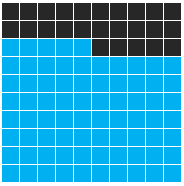
Steps to Create Percentage Chart in Excel
1. Select 10 Rows and 10 Columns (10 X 10 Matrix). Let's say G7:P16.

2. Shade to cells by filling them with black color and apply border to the cells (All Borders).

3. Enter a percentage value in cell D3.

4. Select G7:P16 cells and apply conditional formating using a formula.
Go to Conditional Formating >> Select "New Rule" >> Select "Use a formula to determine which cells to format"And put the following formula in the formula box.
=((ROW($P$16)-ROW())*10+COLUMN()-COLUMN($A$1)+1)<=ROUND($D$3*10^2,0)ROW(P16) => Last row of your matrix. It returns 16. COLUMN(A1) => First column of a sheet. It returns 1. It will always be the same no matter matrix is placed. D3 => Cell in which your percentage value is placed.
Final Step
After pasting the above formula, click on Format button that appears just below the formula box >> Select Fill >> Select Light Blue color >> OK

Deepanshu founded ListenData with a simple objective - Make analytics easy to understand and follow. He has over 10 years of experience in data science. During his tenure, he worked with global clients in various domains like Banking, Insurance, Private Equity, Telecom and HR.
Share Share Tweet