Do you want to spice up your presentation? You know the most boring aspects of presentations are the charts. If they don't look good, they can make your audience yawn. Hence, it is recommended to use correct color combination & style for preparing a chart.
It is a common misbelief that you cannot design a professional-looking chart with MS Excel. See the snapshot below.
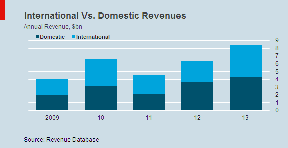
It is a common misbelief that you cannot design a professional-looking chart with MS Excel. See the snapshot below.
 |
| Graphics Inspired by The Economist Magazine - Charts |
Color Combination : Dark Teal, Turquoise, Sky Blue and Red
Tricks
There is nothing difficult about this chart. It's a simple stacked column chart !
The only little bit tricky part about the chart is number-formatting for the horizontal axis.
The idea is to find out the smallest date out of the range and make it in YYYY number format. Otherwise, dates are displayed in YY number format.
The only little bit tricky part about the chart is number-formatting for the horizontal axis.
A2 => 1/1/2009
=TEXT(A2,"yyyy") returns 2009
=TEXT(A2,"[$-407]yy" returns 09
The idea is to find out the smallest date out of the range and make it in YYYY number format. Otherwise, dates are displayed in YY number format.
=IF(A2=MIN($A$2:$A$6),TEXT(A2,"yyyy"),TEXT(A2,"[$-407]yy"))

Deepanshu founded ListenData with a simple objective - Make analytics easy to understand and follow. He has over 10 years of experience in data science. During his tenure, he worked with global clients in various domains like Banking, Insurance, Private Equity, Telecom and HR.
Share Share Tweet