This tutorial covers various techniques to modify and create charts or graphs with SAS. SAS has never been the first choice of analysts for creating graphs/charts as it requires time and skill to code the custom graphs in SAS. Analysts prefer MS Excel over SAS for creating graphs as it's a very quick and easy process in Excel. In this post, i would provide the clear explanation of how to make charts quickly with SAS.
Prepare Dataset for Charts
We would be using SASHELP.CLASS dataset for demonstration of bar charts. This dataset contains five variables such as Name, Sex, Age, Height and Weight for 19 students. I have picked 4 records from each of the two categories of sex MALE and FEMALE to make the dataset smaller so that graphs do not look TOO BIG in the post. Run the program below -
Bar chart is one of the most commonly used charts. It's used to show comparison between two or more categories. It's applicable or acceptable in almost all the domains from BFSI to telecom.
In the program below, HBAR represents horizontal bar, type = defines the type of statistics we need to compute. SUMVAR refers to summary variable. It does not imply SUM/ Addition.
Change Width of the Chart
Set Multiple Colors
You can use multiple PATTERN statements with SUBGROUP= option to fill multiple colors in the graphs.
Percentage Chart
Suppose you need to show the percentage of male and female students in a graph (including the count number).
Grouped Bar Chart
You can use GROUP= option to create hierarchical / grouped bar chart in SAS.
Stacked Bar Chart
The DISCRETE option is used to show each data value in a separate bar. The SUBGROUP= option tells SAS to fill different color in each of the groups.
Histogram
Histogram is used to show distribution of continuous values in a graph. The LEVELS=4 implies we need to show only 4 bars in the histogram.
Scatterplot
Scatterplot is used to see the relationship between two variables. In the graph below, we are looking for relationship between height and weight by male and female.
Box Plot
The following graph is a special case of Box plot in which we are displaying the distribution of continuous variable (height) by a categorical variable (sex).
Prepare Dataset for Charts
We would be using SASHELP.CLASS dataset for demonstration of bar charts. This dataset contains five variables such as Name, Sex, Age, Height and Weight for 19 students. I have picked 4 records from each of the two categories of sex MALE and FEMALE to make the dataset smaller so that graphs do not look TOO BIG in the post. Run the program below -
proc rank data = sashelp.class descending out=temp (where=(weight_r <= 4));
by sex;
var weight;
ranks weight_r;
run;
The above program would create a dataset called TEMP in WORK library which would contain only 8 rows / observations.
Simple Horizontal Bar Chart
Bar chart is one of the most commonly used charts. It's used to show comparison between two or more categories. It's applicable or acceptable in almost all the domains from BFSI to telecom.
In the program below, HBAR represents horizontal bar, type = defines the type of statistics we need to compute. SUMVAR refers to summary variable. It does not imply SUM/ Addition.
title1 "Weights of Students";
proc gchart data=temp;
hbar name / type=sum sumvar=weight;
run;
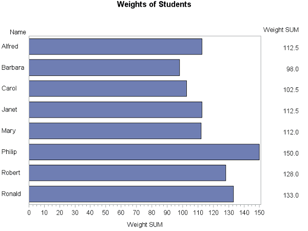 |
| Bar Charts - Example 1 |
Simple Vertical Bar Chart
In this section, we are creating vertical bar chart. The only difference between the previous graph and this graph would be to change the option HBAR to VBAR.
title1 "Weights of Students";
proc gchart data=temp;
vbar name / type=sum sumvar=weight;
run;
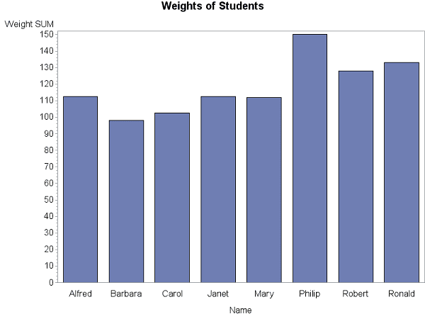 |
| Vertical Bar Chart |
Add Labels in the Vertical Bar Chart
The OUTSIDE= tells SAS to show specific statistics in the data label. In this case, it is SUM. It works only with VBAR option.
title1 "Weights of Students";
proc gchart data=temp;
vbar name / type=sum sumvar=weight outside=sum;
run;
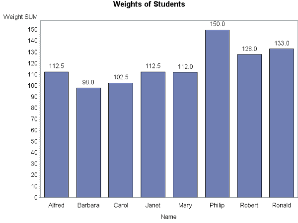 |
| SAS Graphs : Adding Data Labels |
Note : You can use INSIDE= option to show data label at the end of the bars.
Sort Bars
You can use DESCENDING / ASCENDING option to sort the bars by their length.
title1 "Weights of Students";
proc gchart data=temp;
vbar name / type=sum sumvar=weight descending outside=sum;
run;
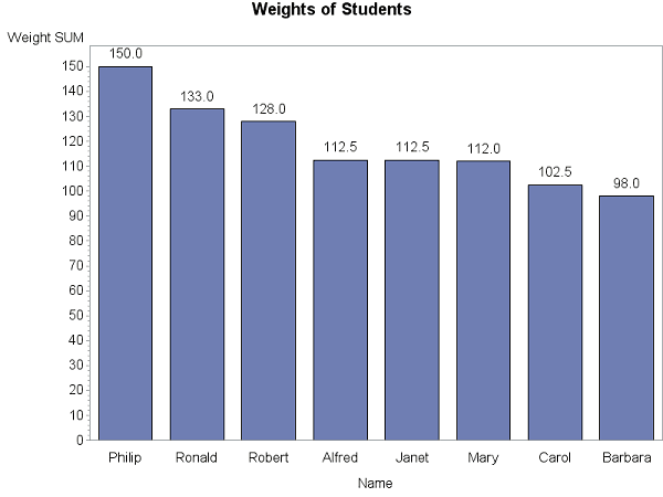 |
| SAS : Sort Bars |
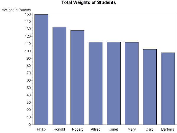
Add / Remove Axes Title
There are three axes to format in SAS.
- Midpoint (Use MAXIS option)
- Group (Use GAXIS option)
- Response (Use RAXIS option)
In the following code, we are removing label from the X Axis and adding custom label in Y axis. The goptions htext=13pt htitle=15pt refers to the font size of the default text and chart title.
title1 "Total Weights of Students";
goptions htext=13pt htitle=15pt;
axis1 label=none;
axis2 label=('Weight in Pounds');
proc gchart data=temp;
vbar name / type=sum sumvar=weight descending
maxis=axis1 raxis=axis2;
run;
quit;
 |
| Add Axes Title |
Change Width of the Chart
You can use WIDTH= option to increase width of the chart. It is very useful technique when we have a smaller number of categories. It is shown in the next section where we have only two categories.
Mean Chart
Suppose you are asked to create a chart which shows the comparison of weights of male vs female. The type=mean option is used to generate mean statistics of the two categories of variable SEX.
title1 "Average Male vs. Female Weights";
goptions htext=13pt htitle=15pt;
axis1 label=none value=(f="Arial/Bold" "Female" "Male"); ;
axis2 label=(a=90 f="Arial/Bold" 'Mean Weight in Pounds') order=(0 to 150 by 25) minor=none offset=(0,0);
proc gchart data=temp;
vbar sex / width= 25 type=mean sumvar=weight descending
maxis=axis1 raxis=axis2 outside=mean;
run;
quit;
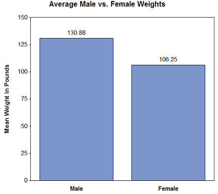 |
| Mean Chart |
In this chart, we have done a lot of formatting. The detailed formatting tips are listed below -
- Assign Value Labels 'Male' 'Female' to X-axis. It is done via axis1 value = option.
- Change the orientation of Y-axis title with 'a=90' in axis2 label.
- Change the scale of Y axis with 'order=(0 to 150 by 25)'.
- minor=none turns off minor tick marks.
- offset=(0,0) remove space between the last number in the axis and the frame.
Change color of the Chart
You can set the color of the chart with PATTERN statement. The outline color of the bar can be changed with COUTLINE= option. We can also custom (hex) colors in the graph. See the custom color used in the following graph.
pattern1 v=solid color=red;
proc gchart data=temp;
vbar sex / width= 25 type=mean sumvar=weight descending
maxis=axis1 raxis=axis2 outside=mean coutline=gray;
run;
quit;
Set Multiple Colors
You can use multiple PATTERN statements with SUBGROUP= option to fill multiple colors in the graphs.
title1 "Average Male vs. Female Weights";
pattern1 value=solid color=pink;
pattern2 value=solid color=cx42C0FB;
proc gchart data=temp;
vbar sex / width= 25 type=mean sumvar=weight descending
maxis=axis1 raxis=axis2 outside=mean coutline=gray subgroup=sex;
run;
quit;
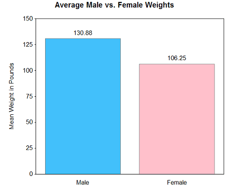 |
| SAS Graphs : Multiple Colors |
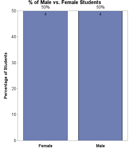
Percentage Chart
Suppose you need to show the percentage of male and female students in a graph (including the count number).
 |
| SAS : Percentage Chart |
title1 "% of Male vs. Female Students";To show both frequent and %, use INSIDE= and OUTSIDE= options.
goptions htext=13pt htitle=15pt;
axis1 label=none value=(f="Arial/Bold" "Female" "Male"); ;
axis2 label=(a=90 f="Arial/Bold" 'Percentage of Students') minor=none offset=(0,0);
proc gchart data=temp;
vbar sex / width= 25 type=pct descending
maxis=axis1 raxis=axis2 inside= freq outside=pct;
run;
quit;
Grouped Bar Chart
You can use GROUP= option to create hierarchical / grouped bar chart in SAS.
title;
axis1 label=('MSRP') minor=none offset=(0,0);
axis2 label=none;
axis3 label=none offset=(7,7);
proc gchart data=sashelp.cars;
vbar type / discrete type=mean sumvar=msrp
group=origin coutline=gray raxis=axis1 maxis=axis2 gaxis=axis3 noframe;
run;
quit;
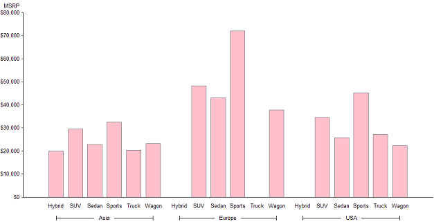 |
| SAS : Grouped Bar Chart |
Stacked Bar Chart
The DISCRETE option is used to show each data value in a separate bar. The SUBGROUP= option tells SAS to fill different color in each of the groups.
title;
axis1 label=('MSRP') minor=none offset=(0,0);
axis2 label=none offset=(7,7);
proc gchart data=sashelp.cars;
vbar type / discrete type=mean sumvar=msrp
subgroup=origin coutline=gray width=10
raxis=axis1 maxis=axis2 noframe;
run;
quit;
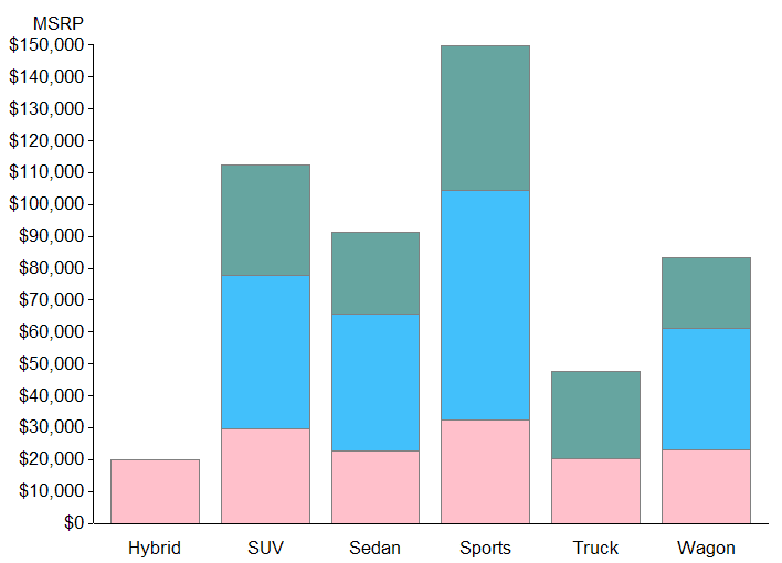 |
| SAS : Stacked Bar Chart |
Histogram
Histogram is used to show distribution of continuous values in a graph. The LEVELS=4 implies we need to show only 4 bars in the histogram.
title;
goptions htext=10pt htitle=12pt;
proc gchart data=temp;
vbar weight / space=1 width=10 outside=freq levels=4 range;
run; quit;
Scatterplot
Scatterplot is used to see the relationship between two variables. In the graph below, we are looking for relationship between height and weight by male and female.
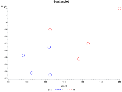 |
| Scatterplot with SAS |
symbol1 value=circle height=3 interpol=none color=blue;PROC GPLOT is used to create scatter plot, box plot and line chart in SAS.
symbol2 value=circle height=3 interpol=none color=red;
proc gplot data=temp;
plot height*weight=sex;
run;
Box Plot
The following graph is a special case of Box plot in which we are displaying the distribution of continuous variable (height) by a categorical variable (sex).
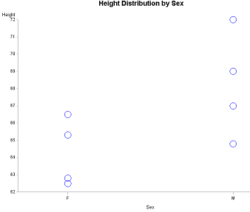 |
| Box Plot |
title "Height Distribution by Sex";
symbol1 value=circle height=3 interpol=none color=blue;
axis1 minor=none offset=(0,0);
axis2 offset=(20,20);
proc gplot data=temp;
plot height*sex=1 /
vaxis=axis1 haxis=axis2 noframe;
run;
To show 25th, 50th and 75th percentile in the box-plot, use the code below. The only change in the code is to modify the symbol statement.
title "Height Distribution by Sex";
symbol1 interpol=boxt bwidth=4 color=blue;
axis1 minor=none offset=(0,0);
axis2 offset=(20,20);
proc gplot data=temp;
plot height*sex=1 /
vaxis=axis1 haxis=axis2 noframe;
run;
Line Chart
Line chart is used to show trends in data over some time periods.
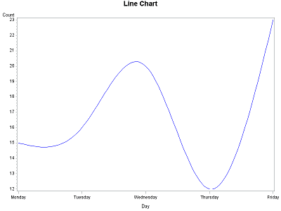 |
| Line Chart with SAS |
title "Line Chart";
symbol1 value=none interpol=sm color=blue;
proc gplot data=sashelp.failure;
where cause ="Contamination" and Process = "Process A";
plot count*day;
run;
quit;
The INTERPOL=SM in SYMBOL statement tells SAS to connect the dots/arrows and create a line.

Deepanshu founded ListenData with a simple objective - Make analytics easy to understand and follow. He has over 10 years of experience in data science. During his tenure, he worked with global clients in various domains like Banking, Insurance, Private Equity, Telecom and HR.
Can you please provide inputs on creating live charts for stock market data lke candle sticks etc. please?
ReplyDelete