This tutorial explains how to create charts used for Infographics in R. The word


Infographics is made up of two words Information and Graphics. It simply means graphical visual representation of information. They are visually appealing and attracts attention of audience. In presentations, it adds WOW factor and makes you stand out in a crowd.

Update : This article has been updated for Font Awesome 5. It works in both R version 4.x and 3.5 / 3.6.x
Install the packages used for Infographic Charts
You can install these packages by running command install.packages(). The package echarts4r.assets is not available on CRAN so you need to install it from github account by running this command devtools::install_github("JohnCoene/echarts4r.assets")
- waffle
- extrafont
- showtext
- tidyverse
- hrbrthemes
- echarts4r
- echarts4r.assets
Waffle (Square Pie Chart)
In this section we will see how to create waffle chart in R. Waffle charts are also known as square pie or matrix charts. They show distribution of a categorical variable. It's an alternative to pie chart. It should be used when number of categories are less than 4. Higher the number of categories, more difficult would be read this chart. In the following example, we are showing percentage of respondents who answered 'yes' or 'no' in a survey.Make sure to install the latest version of the package from github by running this command -
devtools::install_github("hrbrmstr/waffle")
library(waffle)
waffle(
  c('Yes=70%' = 70, 'No=30%' = 30), rows = 10, colors = c("#FD6F6F", "#93FB98"),
  title = 'Responses', legend_pos="bottom"
)

Use Icon in Waffle
Steps to download and install fontawesome fonts
- First step is to load extrafont library by running this command
library(extrafont) - Download and install
fontawesomefonts from this URLhttps://github.com/FortAwesome/Font-Awesome/tree/master/webfonts. You need to download these 3 files - fa-solid-900.ttf, fa-regular-400.ttf and fa-brands-400.ttf - Once downloades the above 3 files you need to install them as well by double clicking on it and then hit Install button.
- Import downloaded fontawesome font by using this command. Make sure to specify your folder location containing fontawesome.
extrafont::font_import (path="C:\\Users\\DELL\\Downloads", pattern = "fa-", prompt = FALSE) - Load fonts by using the command
loadfonts(device = "win") - Check whether font awesome is installed successfully by running this command
It should return :extrafont::fonttable() %>% dplyr::as_tibble() %>% dplyr::filter(grepl("Awesom", FamilyName)) %>% select(FamilyName, FontName, fontfile)FamilyName FontName fontfile Font Awesome 5 Brands Regular FontAwesome5Brands-Regular C:\Users\DELL\Downloads\fa-brands-400.ttf Font Awesome 5 Free Regular FontAwesome5Free-Regular C:\Users\DELL\Downloads\fa-regular-400.ttf Font Awesome 5 Free Solid FontAwesome5Free-Solid C:\Users\DELL\Downloads\fa-solid-900.ttf - You also need to add new font families to 'sysfonts'. You can do it by using
font_add( )function fromshowtextlibrary. File locations in the script below should be the place where these downloaded font files are stored.library(showtext) font_add(family = "FontAwesome5Free-Solid", regular = "C:\\Users\\DELL\\Downloads\\fa-solid-900.ttf") font_add(family = "FontAwesome5Free-Regular", regular = "C:\\Users\\DELL\\Downloads\\fa-regular-400.ttf") font_add(family = "FontAwesome5Brands-Regular", regular = "C:\\Users\\DELL\\Downloads\\fa-brands-400.ttf") showtext_auto()
use_glyph= refers to icon you want to show in the chart and glyph_size= refers to size of the icon.
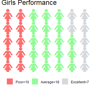
waffle(
  c(`Poor=10` =10, `Average=18` = 18, `Excellent=7` =7), rows = 5, colors = c("#FD6F6F", "#93FB98", "#D5D9DD"),
  use_glyph = "female", glyph_size = 12 ,title = 'Girls Performance', legend_pos="bottom"
)
By default,
Font Awesome 5 Free Solid font is selected. If you want to change the font, you need to make changes in the following 2 arguments.
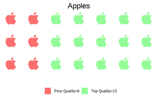
glyph_font = "Font Awesome 5 Free Solid", glyph_font_family = "FontAwesome5Free-Solid"To use Font Awesome 5 Brands, you can do like this. Here I am using apple icon.
waffle(
  c(`Poor Quality=6` = 6, `Top Quality=15` = 15),
  rows = 3, colors = c("#FD6F6F", "#93FB98"),
  use_glyph = "apple",
  glyph_size = 12,
  glyph_font = "Font Awesome 5 Brands Regular",
  glyph_font_family = "FontAwesome5Brands-Regular",
  title = 'Apples',
  legend_pos="bottom"
) + theme(plot.title = element_text(hjust = 0.5))
How to search name of icon?
By using fa_grep( ) function you can look for icon name and its corresponding font style.
waffle::fa_grep("apple")
How to align multiple waffle charts
By using iron( ) function you can left-align waffle plots. You can use ggplot2 functions to customize the plot (like I did in the program below to center align the title using plot.title = )
iron(
  waffle(
    c('TRUE' = 7, 'FALSE' = 3),
    colors = c("pink", "grey70"),
    use_glyph = "female",
    glyph_size = 12,
    title = "Female vs Male",
    rows = 1,
    legend_pos = "none"
  ) + theme(plot.title = element_text(hjust = 0.5))
  ,
  waffle(
    c('TRUE' = 8, 'FALSE' = 2),
    colors = c("skyblue", "grey70"),
    use_glyph = "male",
    glyph_size = 12,
    rows = 1,
    legend_pos = "none"
  )
  )

Percentage or Contribution Chart
If you are bored of pie chart and want to show contibution / concentration via fancy way. In waffle you can display icons instead of squared boxes. The best part of the program below is that it works with our favorite ggplot2 package.
make_proportional = TRUE scale the value column and convert it into proportion of total.
library(ggplot2)
library(waffle)
library(hrbrthemes)
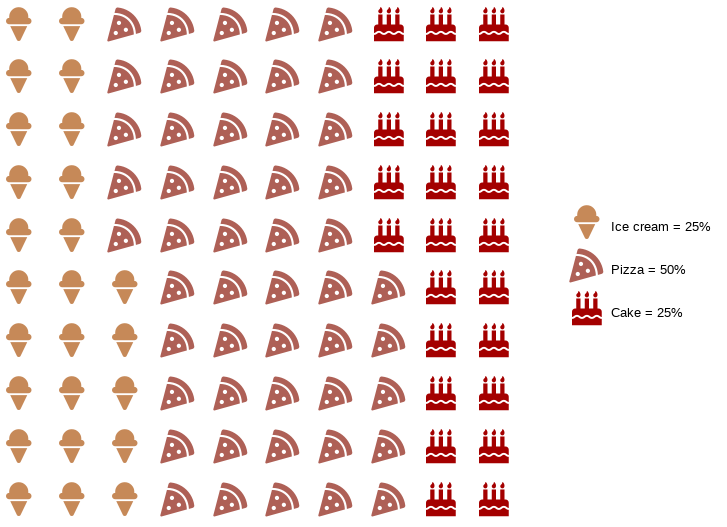
mydf <- data.frame(food_group = factor(c("Ice Cream", "Pizza", "Cake"),
levels=c("Ice Cream", "Pizza", "Cake")), consumption = c(10, 20, 10))
# Scales and preparing for labels
scalevalues <- sprintf("%.0f%%",round(prop.table(mydf$consumption)*100, 3))
customtext <- c(
paste("Ice cream", '=', scalevalues[1]),
paste("Pizza", '=', scalevalues[2]),
paste("Cake", '=', scalevalues[3])
)
ggplot(mydf, aes(label = food_group,
values = consumption,
color = food_group)) +
geom_pictogram(n_rows = 10, make_proportional = TRUE) +
scale_color_manual(
name = NULL,
values = c(
`Ice Cream` = "#c68958",
Pizza = "#ae6056",
Cake = "#a40000"
),
labels = customtext
) +
scale_label_pictogram(
name = NULL,
values = c(
`Ice Cream` = "ice-cream",
Pizza = "pizza-slice",
Cake = "birthday-cake"
),
labels = customtext) +
coord_equal() +
theme_ipsum_rc(grid="") +
theme_enhance_waffle() +
theme(legend.key.height = unit(2.25, "line")) +
theme(legend.text = element_text(size = 10, hjust = 0, vjust = 0.75))
Pictorial Charts in R
Pictorial charts show data scaled in picture or image form instead of bars or columns. They are also called pictogram charts. Let's create fake data for illustrative purpose.df22 <- data.frame( x = sort(LETTERS[1:5], decreasing = TRUE), y = sort(sample(20:80,5)) )
  x  y
1 E 27
2 D 29
3 C 45
4 B 46
5 A 78
e_pictorial(value, symbol) function is used for pictorial plots. The second parameter symbol refers to built-in symbols like circle, rect, roundRect, triangle, diamond, pin, arrow, icon, images and SVG Path. Built-in symbols can be used like symbol = "rect"
library(echarts4r)
library(echarts4r.assets)

df22 %>%
  e_charts(x) %>%
  e_pictorial(y, symbol = ea_icons("user"),
              symbolRepeat = TRUE, z = -1,
              symbolSize = c(20, 20)) %>%
  e_theme("westeros") %>%
  e_title("People Icons") %>%
  e_flip_coords() %>%
  # Hide Legend
  e_legend(show = FALSE) %>%
  # Remove Gridlines
  e_x_axis(splitLine=list(show = FALSE)) %>%
  e_y_axis(splitLine=list(show = FALSE)) %>%
  # Format Label
  e_labels(fontSize = 16, fontWeight ='bold', position = "right", offset=c(10, 0))

Add Images in Chart
If you are using images, make sure to precede it with image:// before image address. In the code below, we have used paste0( ) function to concatenate it before image address.
Unity <- "https://im.rediff.com/news/2018/oct/29statue-of-unity.png"
Buddha <-"http://im.rediff.com/news/2018/oct/29spring-temple-buddha-china.png"

data <- data.frame(
  x = c("Statue of Unity", "Spring Temple Buddha"),
  value = c(182, 129),
  symbol = c(paste0("image://", Unity),
             paste0("image://", Buddha))
)

data %>%
  e_charts(x) %>%
  e_pictorial(value, symbol) %>%
  e_theme("westeros") %>%
  e_legend(FALSE) %>%
  # Title Alignment
  e_title("Statues Height", left='center', padding=10) %>%
  e_labels(show=TRUE) %>%
  e_x_axis(splitLine=list(show = FALSE)) %>%
  e_y_axis(show=FALSE, min=0,max=200, interval=20, splitLine=list(show = FALSE))

Pencil Chart in R
Instead of bars, we are using pencil to show comparison of values.
df02 <- data.frame(
  x = LETTERS[1:10],
  y = sort(sample(10:80,10), decreasing = TRUE)
)

df02 %>%
  e_charts(x) %>%
  e_pictorial(y, symbol = paste0("image://","https://blogger.googleusercontent.com/img/b/R29vZ2xl/AVvXsEjdIvbZg3pAeWligDT-yEe_Q3fbV4A8DXmts6cd-8s6vrOF4zZAYoVeUI1gpxDnZC0VdhJeapdZN3RcTMwNPY_0mK_ZTaEo5B_7tP4rrnzIeRB_62ZC9mup8P8EnkeCMdiU1QpojreIiew0/s1600/pencil.png")) %>%
  e_theme("westeros") %>%
  e_title("Pencil Chart",  padding=c(10,0,0,50))%>%
  e_labels(show = TRUE)%>%
  e_legend(show = FALSE) %>%
  e_x_axis(splitLine=list(show = FALSE)) %>%
  e_y_axis(show=FALSE, splitLine=list(show = FALSE))

Fill Male, Female Icons based on percentage
To find SVG Path, download desired SVG file from https://iconmonstr.com/ and open it in chrome and then find path in page source.
gender = data.frame(gender=c("Male", "Female"), value=c(65, 35),
                    path = c('path://M18.2629891,11.7131596 L6.8091608,11.7131596 C1.6685112,11.7131596 0,13.032145 0,18.6237673 L0,34.9928467 C0,38.1719847 4.28388932,38.1719847 4.28388932,34.9928467 L4.65591984,20.0216948 L5.74941883,20.0216948 L5.74941883,61.000787 C5.74941883,65.2508314 11.5891201,65.1268798 11.5891201,61.000787 L11.9611506,37.2137775 L13.1110872,37.2137775 L13.4831177,61.000787 C13.4831177,65.1268798 19.3114787,65.2508314 19.3114787,61.000787 L19.3114787,20.0216948 L20.4162301,20.0216948 L20.7882606,34.9928467 C20.7882606,38.1719847 25.0721499,38.1719847 25.0721499,34.9928467 L25.0721499,18.6237673 C25.0721499,13.032145 23.4038145,11.7131596 18.2629891,11.7131596 M12.5361629,1.11022302e-13 C15.4784742,1.11022302e-13 17.8684539,2.38997966 17.8684539,5.33237894 C17.8684539,8.27469031 15.4784742,10.66467 12.5361629,10.66467 C9.59376358,10.66467 7.20378392,8.27469031 7.20378392,5.33237894 C7.20378392,2.38997966 9.59376358,1.11022302e-13 12.5361629,1.11022302e-13',
'path://M28.9624207,31.5315864 L24.4142575,16.4793596 C23.5227152,13.8063773 20.8817445,11.7111088 17.0107398,11.7111088 L12.112691,11.7111088 C8.24168636,11.7111088 5.60080331,13.8064652 4.70917331,16.4793596 L0.149791395,31.5315864 C-0.786976655,34.7595013 2.9373074,35.9147532 3.9192135,32.890727 L8.72689855,19.1296485 L9.2799493,19.1296485 C9.2799493,19.1296485 2.95992025,43.7750224 2.70031069,44.6924335 C2.56498417,45.1567684 2.74553639,45.4852068 3.24205501,45.4852068 L8.704461,45.4852068 L8.704461,61.6700801 C8.704461,64.9659872 13.625035,64.9659872 13.625035,61.6700801 L13.625035,45.360657 L15.5097899,45.360657 L15.4984835,61.6700801 C15.4984835,64.9659872 20.4191451,64.9659872 20.4191451,61.6700801 L20.4191451,45.4852068 L25.8814635,45.4852068 C26.3667633,45.4852068 26.5586219,45.1567684 26.4345142,44.6924335 C26.1636859,43.7750224 19.8436568,19.1296485 19.8436568,19.1296485 L20.3966199,19.1296485 L25.2043926,32.890727 C26.1862111,35.9147532 29.9105828,34.7595013 28.9625083,31.5315864 L28.9624207,31.5315864 Z M14.5617154,0 C17.4960397,0 19.8773132,2.3898427 19.8773132,5.33453001 C19.8773132,8.27930527 17.4960397,10.66906 14.5617154,10.66906 C11.6274788,10.66906 9.24611767,8.27930527 9.24611767,5.33453001 C9.24611767,2.3898427 11.6274788,0 14.5617154,0 L14.5617154,0 Z'))

  gender %>%
  e_charts(gender) %>%
  e_x_axis(splitLine=list(show = FALSE),
           axisTick=list(show=FALSE),
           axisLine=list(show=FALSE),
           axisLabel= list(show=FALSE)) %>%
  e_y_axis(max=100,
           splitLine=list(show = FALSE),
           axisTick=list(show=FALSE),
           axisLine=list(show=FALSE),
           axisLabel=list(show=FALSE)) %>%
  e_color(color = c('#69cce6','#eee')) %>%
  e_pictorial(value, symbol = path, z=10, name= 'realValue',
              symbolBoundingData= 100, symbolClip= TRUE) %>%
  e_pictorial(value, symbol = path, name= 'background',
              symbolBoundingData= 100) %>%
  e_labels(position = "bottom", offset= c(0, 10),
           textStyle =list(fontSize= 20, fontFamily= 'Arial',
                           fontWeight ='bold',
                           color= '#69cce6'),
           formatter="{@[1]}% {@[0]}") %>%
  e_legend(show = FALSE) %>%
  e_theme("westeros")
Show icon as label in plot
Inlabel =, mention unicode of the fontawesome icon.
library(ggplot2)
ggplot (mtcars)  +
  geom_text( aes ( mpg , wt , colour = factor ( cyl )),
             label =  "\uf1b9" ,
             family =  "FontAwesome" ,
             size =  7)


Deepanshu founded ListenData with a simple objective - Make analytics easy to understand and follow. He has over 10 years of experience in data science. During his tenure, he worked with global clients in various domains like Banking, Insurance, Private Equity, Telecom and HR.
Thank you for this brilliant and very useful article. Amazingly good.
ReplyDeleteGlad you liked it. Cheers!
DeleteAwesome
ReplyDeleteThank very interesting
ReplyDeleteBrilliant....thanks for this
ReplyDeleteThe second graph (with the "female" glyph) didn't work for me. The shape it's like a rectangle with a point inside. Do you have any idea to solve this?
ReplyDeleteIt means font awesome was not installed on your system. Follow the steps mentioned in the article to install the same.
ReplyDeleteThanks for your excellent work! Meanwhile, as for the 'fontawesome' package, I got this message saying "package ‘https://cdnjs.cloudflare.com/ajax/libs/font-awesome/4.7.0/fonts/fontawesome-webfont.ttf’ is not available (for R version 3.6.1)" because I'm using R version 3.6.1. All I need to do is wait for a while untill the upgrading of the package~
ReplyDelete>
2° graphics:
ReplyDeleteWarning message:
In grid.Call.graphics(C_text, as.graphicsAnnot(x$label), x$x, x$y, :
font family not found in Windows font database
You need to install fontawesome on your system.
DeleteThanks!
ReplyDeletewill these infographics transfer onto r markdown when knitted into a pdf?
ReplyDeleteI have installed the fonts as instructed, the fonts are definitely in my fonts folder in Windows, but i still get this error message "font family not found in Windows font database" It was working this morning, I updated to the newest version of R and it no Longer works.
ReplyDeleteIt also had updated the version of awsomefont to version 5, which does not seem to load into R.
ReplyDeleteWhen creating a pictorial fill based on percentage, how can I stop the image from stretching responsively to the window size?
ReplyDeleteHey! I tried to download this package but it gave me this error:
ReplyDeleteThe downloaded binary packages are in
/var/folders/2t/t4psc_793fq54r8jmqw99_t80000gp/T//Rtmpn9QyQK/downloaded_packages
internal error -3 in R_decompress1Error: Failed to install 'echarts4r.assets' from GitHub:remotes180e65a92bfdd/JohnCoene-echarts4r.assets-77b1fe0/DESCRIPTION’ ...
lazy-load database '/Library/Frameworks/R.framework/Versions/3.6/Resources/library/magrittr/R/magrittr.rdb' is corrupt