In this tutorial, we will cover how to create a bar chart in SAS, along with examples.
Syntax for Creating a Bar Chart in SAS
The code below shows the syntax to create different types of Bar Charts in SAS.
proc sgplot data = dataset-name;
vbar variable1;
run;
proc sgplot data = dataset-name;
hbar variable1;
run;
proc sgplot data = dataset-name;
vbar variable1 / group = variable2 groupdisplay=stack;
run;
proc sgplot data = dataset-name;
vbar variable1 / group = variable2 groupdisplay = cluster;
run;
proc sgplot data = dataset-name;
hbar variable1 / group = variable2 groupdisplay=stack;
run;
proc sgplot data = dataset-name;
hbar variable1 / group = variable2 groupdisplay = cluster;
run;
proc sgplot data=dataset-name pctlevel=group;
vbar variable1 / group=variable2 groupdisplay=stack stat=pct;
run;
In this tutorial, we will be using the sashelp.cars dataset which is a built-in dataset in SAS that contains information about various car models.
Bar Chart
A bar chart uses vertical bars to represent data. Each bar's height corresponds to the data's value, and the bars are displayed from the bottom to the top. It's useful for comparing values across categories or when category labels are short. The vertical bar chart is also called a Column Chart.
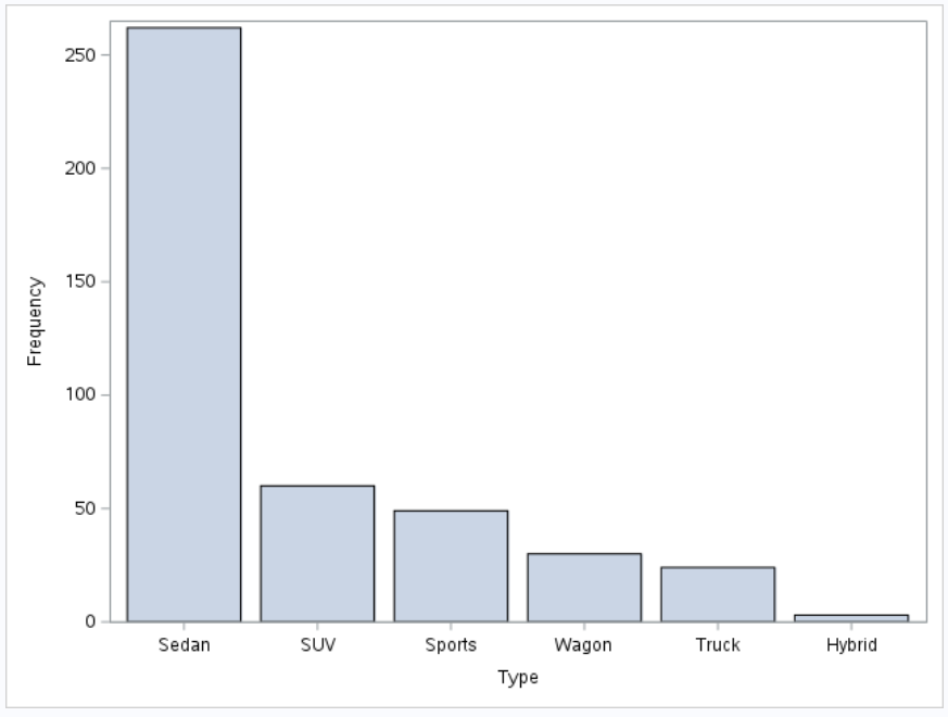
Simple Bar Chart
The following code uses the SGPlot procedure to create a vertical bar chart (vbar) of the "type" variable from the "sashelp.cars" dataset. The chart will display the frequency or count of each distinct value of the "type" variable.
proc sgplot data=sashelp.cars;
vbar type;
run;

proc sgplot:This is the procedure to create statistical graphics (SG) plots in SAS.data=sashelp.cars:This specifies the dataset "sashelp.cars" that contains the data to be used for creating the bar chart.vbar type;: This is the vbar statement that creates the vertical bar chart. "type" is the variable that will be used for the bar chart.
Stacked Bar Chart
The following code uses the SGPlot procedure to create a stacked bar chart showing the distribution of car types based on their countries of origin using data from the sashelp.cars dataset.
proc sgplot data = sashelp.cars;
vbar type / group = origin groupdisplay=stack;
run;

group = origin: It tells SAS to use theoriginvariable as the grouping variable. Theoriginvariable in thesashelp.carsdataset represents the country of origin for each car model.groupdisplay=stack: This option specifies that the bars representing different groups (in this case, the countries of origin) will be stacked on top of each other, forming a stacked bar chart.
Clustered Bar Chart
The following code uses the SGPlot procedure to create a clustered bar chart showing the distribution of car types based on their countries of origin using data from the sashelp.cars dataset.
proc sgplot data=sashelp.cars;
vbar type / group=origin groupdisplay=cluster;
run;
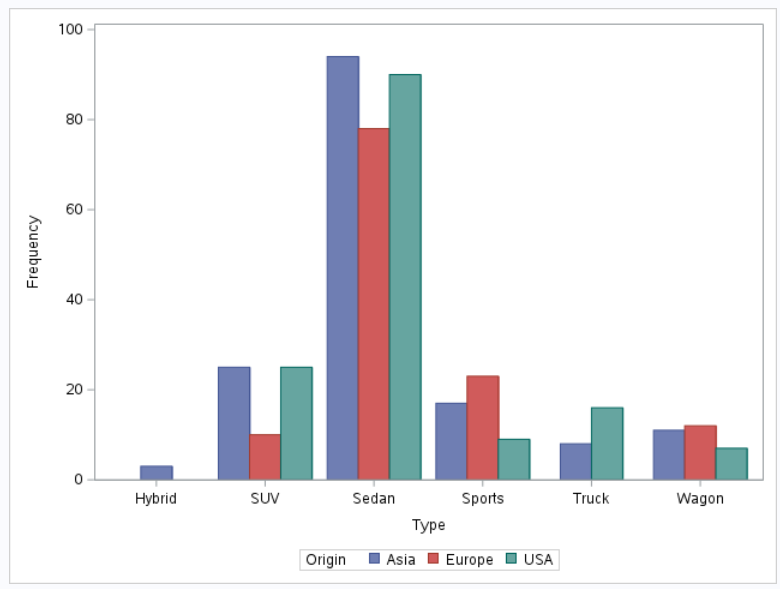
groupdisplay=cluster: This option specifies that the bars representing different groups (in this case, the countries of origin) will be clustered side by side in the bar chart.
Segmented Bar Chart
A segmented bar chart is a type of bar chart that shows multiple sets of data on a single bar, segmented into different categories. It is also called a stacked bar chart with multiple segments. In a segmented bar chart, each bar represents a total, and the segments of the bar represent different categories that make up that total.
The following code uses the PROC SGPLOT procedure to create a segmented bar chart using the sashelp.cars dataset.
proc sgplot data=sashelp.cars pctlevel=group;
vbar type / group=origin groupdisplay=stack stat=pct;
run;

Horizontal Bar Chart
A horizontal bar chart uses horizontal bars to show data. Each bar's length corresponds to the data's value, and the bars go from left to right. It's useful for comparing values across categories or when category labels are long.
Simple Horizontal Bar Chart
The following code uses the SGPlot procedure to create a horizontal bar chart (hbar) of the "type" variable from the "sashelp.cars" dataset.
proc sgplot data = sashelp.cars;
hbar type;
run;

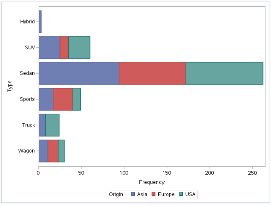
Stacked Horizontal Bar Chart
The following code uses the SGPlot procedure to create a stacked horizontal bar chart showing the distribution of car types based on their countries of origin using data from the sashelp.cars dataset.
proc sgplot data = sashelp.cars;
hbar type / group = origin groupdisplay=stack;
run;
Clustered Horizontal Bar Chart
The following code uses the SGPlot procedure to create a clustered horizontal bar chart showing the distribution of car types based on their countries of origin using data from the sashelp.cars dataset.
proc sgplot data=sashelp.cars;
hbar type / group=origin groupdisplay=cluster;
run;

How to Add Data Labels in a Bar Chart in SAS
The datalabel option tells SAS that data labels will be displayed on top of each bar in the bar chart. The data labels show the actual values corresponding to each bar, making it easier to read and understand the values represented by the bars.
proc sgplot data=sashelp.cars;
vbar type / datalabel;
run;

How to Sort Bars in a Bar Chart in SAS
The CATEGORYORDER= option tells SAS to sort the bars based on the values. You can use CATEGORYORDER = RESPASC for ascending order and CATEGORYORDER = RESPDESC for descending order.
proc sgplot data=sashelp.cars;
vbar type / categoryorder=respdesc;
run;
How to Add Percentage in a Bar Chart in SAS
The following code uses the PROC SGPLOT procedure to create a bar chart with percentages using the sashelp.cars dataset.
proc sgplot data=sashelp.cars;
vbar type / stat=pct;
run;

stat=pct: This option specifies that the percentages will be displayed on the bar chart. It will show the percentage distribution of each car type relative to the total count of car types.
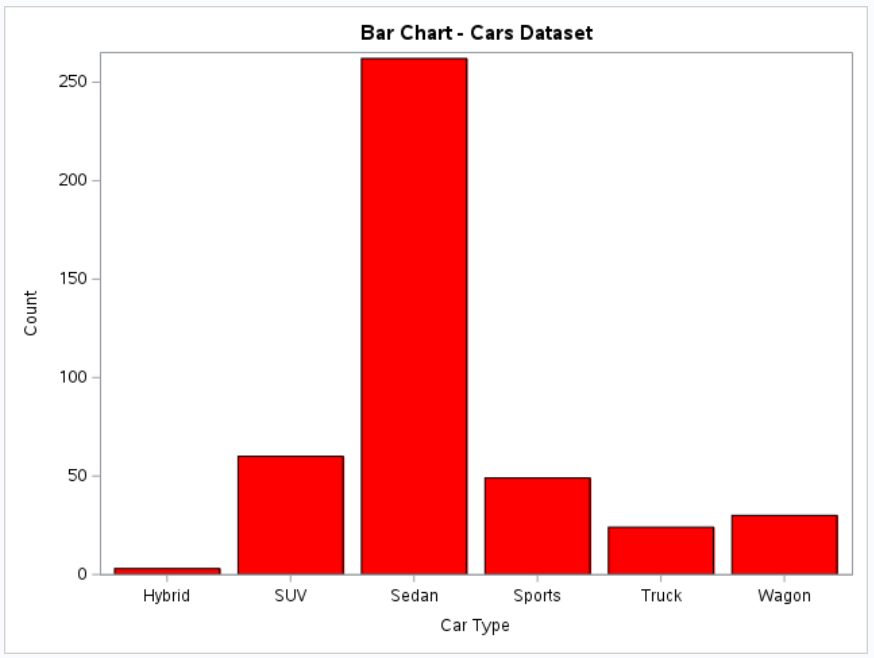
How to Customize Bar Chart in SAS
title "Bar Chart - Cars Dataset";
proc sgplot data=sashelp.cars;
    vbar type / fillattrs=(color=red);
    xaxis label="Car Type";
    yaxis label="Count";
run;
title "Bar Chart - Cars Dataset";: Sets the title of the chart to "Bar Chart - Cars Dataset".fillattrs=(color=red);: It sets the color of the bars to red.xaxis label="Car Type";: Sets the label for the X-axis of the chart to "Car Type".yaxis label="Count";: Sets the label for the Y-axis of the chart to "Count".

Deepanshu founded ListenData with a simple objective - Make analytics easy to understand and follow. He has over 10 years of experience in data science. During his tenure, he worked with global clients in various domains like Banking, Insurance, Private Equity, Telecom and HR.
Share Share Tweet