Whether you're choosing paint for a room or are designing a presentation, color is the most important element. If colors are carefully chosen they can have a strong positive impact on your audience.
Color is definitely a very important element of infographics, and a great use of color schemes help to create an eye candy infographics.
Today we will show you some examples of infographics that are using beautiful and inspiring color combinations that match perfectly and create a captivating infographics.
1. Fonts & Colors
Tasty Placement developed this cool infographic that focuses on the use of fonts and colour among the world's leading brands.

RGB Dec:
45, 45, 45
0, 179, 230
124, 184, 0
246, 79, 53
253, 213, 4
254, 137, 15
227, 228, 230
RGB HTML:
#2D2D2D
#00B3E6
#7CB800
#F64F35
#FDD504
#FE890F
#E3E4E6
2. Retro Infographics
RGB HTML:
#86372F

RGB Dec:
78, 79, 81

RGB Dec:
225, 110, 81
Color is definitely a very important element of infographics, and a great use of color schemes help to create an eye candy infographics.
Today we will show you some examples of infographics that are using beautiful and inspiring color combinations that match perfectly and create a captivating infographics.
1. Fonts & Colors
Tasty Placement developed this cool infographic that focuses on the use of fonts and colour among the world's leading brands.

RGB Dec:
45, 45, 45
0, 179, 230
124, 184, 0
246, 79, 53
253, 213, 4
254, 137, 15
227, 228, 230
RGB HTML:
#2D2D2D
#00B3E6
#7CB800
#F64F35
#FDD504
#FE890F
#E3E4E6
2. Retro Infographics
RGB Dec:
134, 55, 47
89, 32, 38
220, 204, 191
128, 95, 88
220, 204, 191
128, 95, 88
RGB HTML:
#86372F
#592026
#DCCCBF
#805F58
3. Improve Google Ranking
This infographic shows how to improve google ranking of your site. It was designed by Search Engine Land.

RGB Dec:
0, 103, 138
3. Improve Google Ranking
This infographic shows how to improve google ranking of your site. It was designed by Search Engine Land.

RGB Dec:
0, 103, 138
243, 229, 182
254, 255, 253
RGB HTML:
#00678ARGB HTML:
#F3E5B6
#FEFFFD
4. Save Water
4. Save Water

RGB Dec:
8, 185, 239
231, 230, 235
255, 255, 255
RGB HTML:
#4E4F51
#08B9EF
#E7E6EB
#FFFFFF
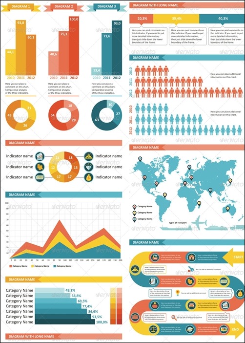
5. Infographics Elements
RGB Dec:
244, 205, 46
66, 146, 161
255, 255, 255
RGB HTML:
#E16E51
#F4CD2E
#4292A1
#FFFFFF

Deepanshu founded ListenData with a simple objective - Make analytics easy to understand and follow. He has over 10 years of experience in data science. During his tenure, he worked with global clients in various domains like Banking, Insurance, Private Equity, Telecom and HR.
Very true, Deepanshu. Colour can make or break a presentation. I also like to use colour to connect related data in dashboards.
ReplyDeleteThank you for stopping by to take a look at my website. A good color palette makes a good dashboard better and helps to increase interest and engagement with target audience.
DeleteVery helpful article! Thank you for sharing, particularly the color codes -- they can be so hard to pinpoint!
ReplyDeleteVery helpful article! Thank you for sharing, particularly the color codes -- they can be so hard to pinpoint!
ReplyDelete