This tutorial explains how to create a column chart in which we can show both values and percentages.
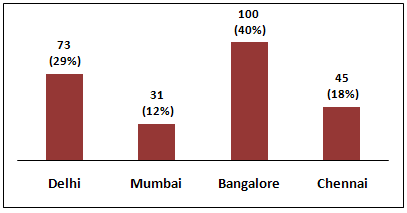 |
| Value and Percentage in Same Column Chart |
Task
Suppose you are asked to show both frequency and percentage distribution in the same bar or column chart.
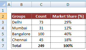
Input Data
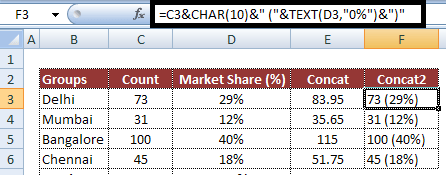
Input values are stored in range B3:D7 as shown in the image below. Column B contains labels, Column C and D contain count and percentages.
 |
| Input Data |
Download the workbook
Steps to show Values and Percentage
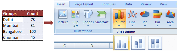
1. Select values placed in range
B3:C6 and Insert a 2D Clustered Column Chart (Go to Insert Tab >> Column >> 2D Clustered Column Chart).
See the image below
 |
| Insert 2D Clustered Column Chart |
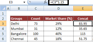
2. In cell E3,
type =C3*1.15 and
paste the formula down till E6
 |
| Insert a formula |
3. In cell F3, type the following formula and paste the formula down till F6.
=C3&CHAR(10)&" ("&TEXT(D3,"0%")&")"
 |
| Formula to concatenate Value and Percentage |
4. Select Chart and click on "Select Data" button. Then click on Add button and Select E3:E6 in Series Values and Keep Series name blank.
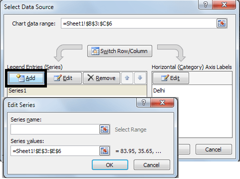 |
| Select Data and Add Series |
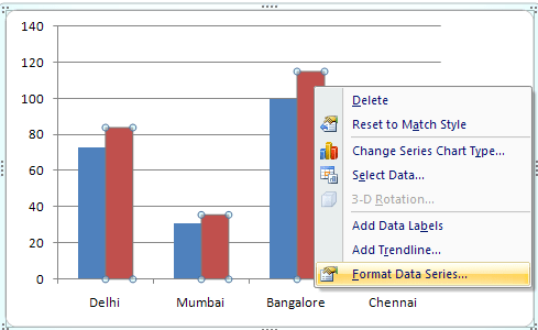
5. In chart, select
Second Bar (or Series 2 Bar) and right click on it and select
Format Data Series and then check
Secondary Axis under
Plot Series On box in Series Options tab.
 |
| Format Data Series |
 |
| Change from Primary to Secondary Axis |
6. Select chart and click on Select Data button and select Series 2 and click on Edit button under Horizontal Axis Labels and then give reference F3:F6 in Axis Label Range.
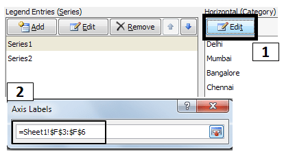 |
| Change Horizontal Axis Labels |
7. Right Click on bar and click on Add Data Labels Button.
8. Right Click on bar and click on Format Data Labels Button and then uncheck Value and Check Category Name.
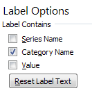 |
| Format Data Labels |
9. Select Bar and make color No Fill ( Go to Format tab >> Under Shape Fill - Select No Fill)
10. Select legends and remove them by pressing
Delete key
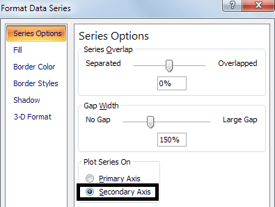
11. Select Secondary Axis and right click on it and
select Format Axis >> Select None in all the 3 drop downs for tick mark and Axis labels (as shown in the image below)
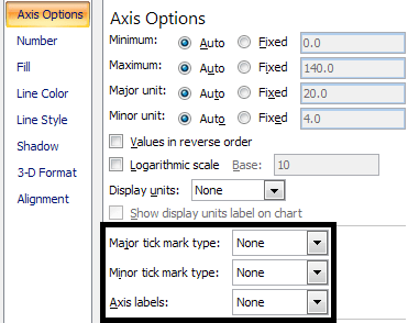 |
| Make Tick Marks and Axis Labels None |
About Author:
Deepanshu founded ListenData with a simple objective - Make analytics easy to understand and follow. He has over 10 years of experience in data science. During his tenure, he worked with global clients in various domains like Banking, Insurance, Private Equity, Telecom and HR.


Thats a brilliant solution. I have faced this issue a number of times and have had to create 2 charts showing counts and percentages. just one thing though, the multiplication factor (1.15 in this case) might have to be changed as per the data distribution otherwise the labels may appear too high or too low
ReplyDeleteNo. The multiplication factor would remain same as it applies on values rather than percentages. The idea of applying multiplicative factor is to create some space above the bar for labels. Download the workbook and try it once. Do let me know incase you face any issue(s).Thanks!
DeleteThanks! Great solution. Had to present data in Board meeting, with limited space available in PPT, so couldn't go with 2 charts. Your solution helped me make it within 1.
ReplyDeleteThis is brilliant, thank you so much, I really appreciate it. Warm greetings from Indonesia.
ReplyDeleteThank you so much, this is helpful. But can we apply this same to multiple columns in same chart.
ReplyDeletefor example, as you are showing different cities in individual bars. I have to show multiple countries and their respective cities.
Great example and fits my dilemma almost... I have multiple 'categories' in each group, so I need a clustered? bar chart with percentages and counts per section of each group (if that makes sense). The immediate problem was getting the axis on the bottom (solved that and was clicking so fast I can't remember how), however need it to read percentages rather than count. Would you be able to help on that? Many thanks again for this solution!
ReplyDeleteHi Deepanshu,
ReplyDeleteI downloaded work sheet for value and percentage column. I entered the details in sheet and prepared the graph and pasted the graph in word document. While when entering the details in next time word document gets automatically updated and therefore, not able to make different graphs using the same work sheet. Every time it is getting updated.
Kindly help
Regards,
Abhishek,
7330886629
So, the value represents that percentage right?
ReplyDeleteHow did the first bar graph disappear?
ReplyDeleteSir can you make a video tutorial of this. I think this is outdated with the nwe version of Excel 360. Thanks in advance!
ReplyDeleteThis is great!
ReplyDeleteCan you please show how to do this with a stacked bargraph?