In this tutorial, we will show various ways to create a histogram in SAS.
The basic syntax for creating a histogram in SAS is as follows:
proc sgplot data=dataset-name;
    histogram variable-name;
run;
proc sgplot: This is the procedure statement that initiates the SGPlot procedure, which is used for creating various types of statistical graphics.data=dataset-name: This specifies the name of the dataset you want to use for creating the histogram. Replacedataset-namewith the actual name of your dataset.histogram variable-name: This statement specifies the variable from the dataset that you want to visualize as a histogram. Replacevariable-namewith the actual name of the variable you want to plot.
In the code below, we are using built-in SAS dataset sashelp.class for the examples in this article. It creates histogram for the column age.
proc sgplot data=sashelp.class;
    histogram age;
run;

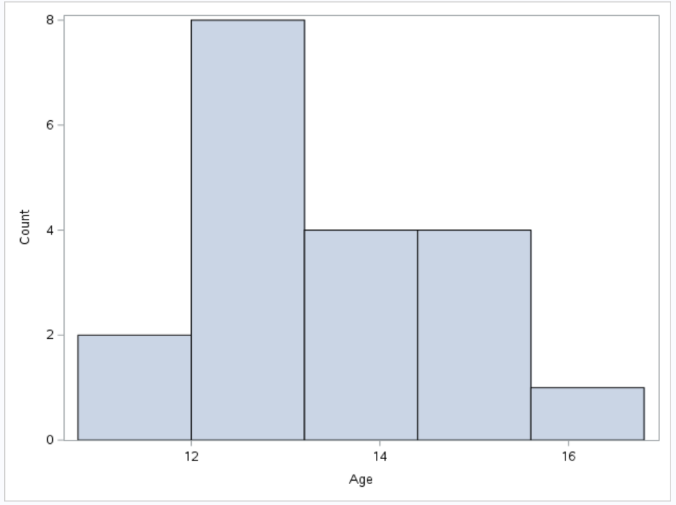
How to Show Count in Y-Axis
By default PROC SGPLOT shows percentage when producing histogram. To show count instead of percentage, we can use the scale=count option in HISTOGRAM statement in PROC SGPLOT.
proc sgplot data=sashelp.class;
    histogram age / scale=count;
run;
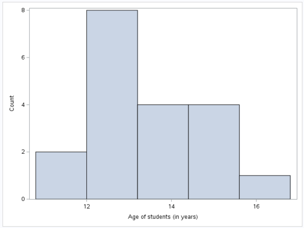
How to Label X-Axis
You can specify label in the LABEL= option in the xaxis statement.
proc sgplot data=sashelp.class;
    histogram age / scale=count;
    xaxis label="Age of students (in years)";
run;
How to Show Density Curve in Histogram
To display a density curve in histogram, we can use the DENSITY statement. The TYPE=NORMAL option indicates it is a normal distribution curve.
proc sgplot data=sashelp.class;
    histogram age;
    density age / type=normal;
run;

How to Color Histogram
We can use the FILLATTRS=(color=color-name) option to customize color in a histogram.
proc sgplot data=sashelp.class;
    histogram age / FILLATTRS=(color=lightblue);
run;

How to Change Bins in Histogram
binstart:x coordinate of the first bin.binwidth:Width of each bin.nbins:Number of bins.showbins:midpoints of the bins to be used to create the tick marks for the x-axis.
Here we are telling SAS to create 5 bins starting from 40 on the x-axis.
proc sgplot data=sashelp.class;
    histogram weight / binstart=40 nbins=5 showbins;
run;
Instead of fixed number of bins, we can also specify the width of each bin using binwidth option.
proc sgplot data=sashelp.class;
    histogram weight / binstart=40 binwidth=20 showbins;
run;
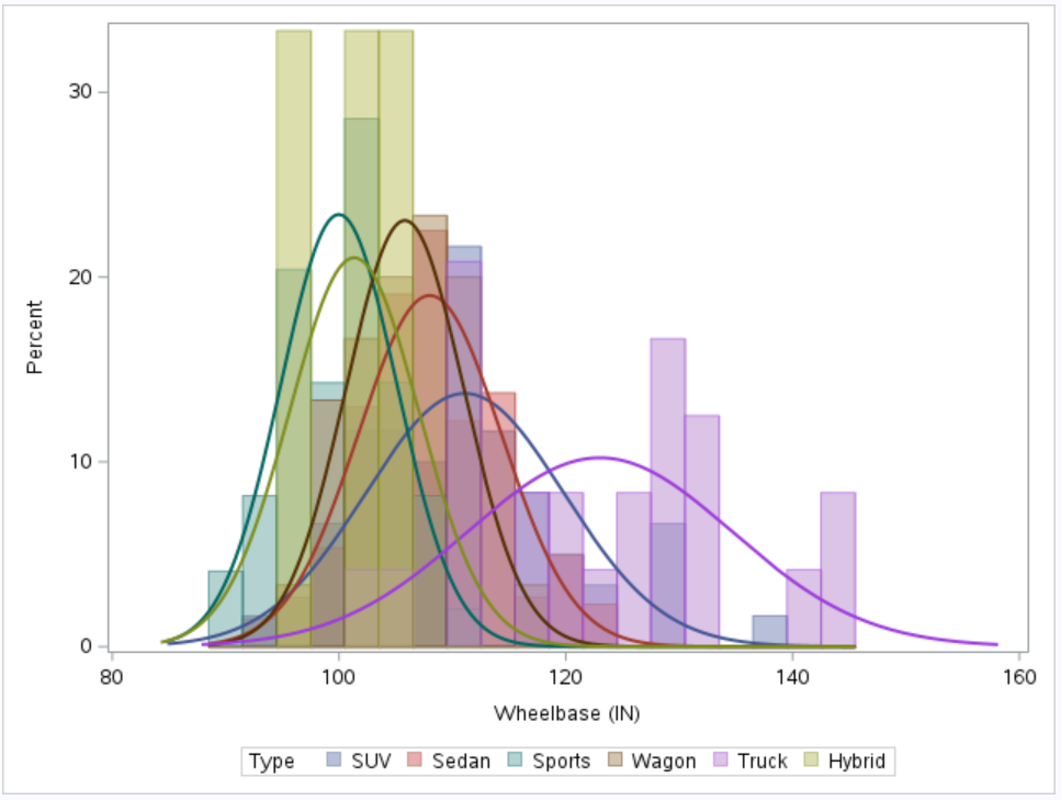
How to Create Histogram by Group
The following code visualizes the distribution of the wheelbase variable using a histogram and a density plot. The group=type option tells SAS to display comparison of the distributions by different categories of the type variable. The transparency=0.5 option shows a partially transparent visualization for the histogram bars.
proc sgplot data=sashelp.cars;
    histogram wheelbase / group=type transparency=0.5;
    density wheelbase / group=type type=normal;
run;

Deepanshu founded ListenData with a simple objective - Make analytics easy to understand and follow. He has over 10 years of experience in data science. During his tenure, he worked with global clients in various domains like Banking, Insurance, Private Equity, Telecom and HR.
Share Share Tweet