This tutorial explains how to create a scatter plot in SAS, along with examples.
The basic syntax for creating a scatter plot in SAS is as follows:
proc sgplot data=dataset-name;
    scatter x = variable1  y = variable2;
run;
proc sgplot data=dataset-name;: This line initiates the SGPlot procedure and specifies the dataset to be used for creating the plot. Replacedataset-namewith the actual name of your dataset.scatter x=variable1 y=variable2;: This line specifies the variables to be plotted on the X and Y axes. Replacevariable1with the name of the variable you want to use for the X-axis andvariable2with the name of the variable for the Y-axis.run;: This line indicates the end of the SGPlot procedure block.
Example 1: Create Basic Scatter Plot in SAS
The following code uses PROC SGPLOT procedure to generate a scatter plot using the "petallength" variable on the X-axis and "sepallength" variable on the Y-axis from the built-in "sashelp.iris" dataset.
proc sgplot data=sashelp.iris;
scatter x = petallength  y = sepallength;
run;

Example 2: How to Add Regression Line to Scatter Plot
Suppose you want to see the relationship between "petallength" and "sepallength". You can add a regression line using REG statement.
proc sgplot data=sashelp.iris;
scatter x = petallength  y = sepallength;
reg x = petallength  y = sepallength / lineattrs=(color=red thickness=2);
run;
lineattrs=(color=red thickness=2) tells SAS to apply a red color and some thickness to the regression line.

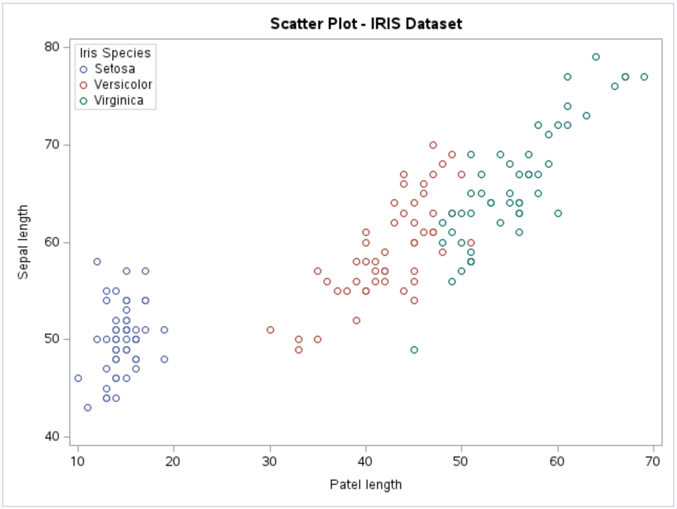
Example 3: How to Create Grouped Scatter Plot
By using group= option in sgplot procedure, we can create a grouped scatter plot in SAS.
proc sgplot data=sashelp.iris;
    scatter x = petallength  y = sepallength / group=species;
run;

Example 4: How to Customize Scatter Plot
proc sgplot data=sashelp.iris;
    scatter x = petallength  y = sepallength / group=species;
    title 'Scatter Plot of Patel Length and Sapel Length';
    xaxis label = 'Patel Length of Iris Flowers';
    yaxis label = 'Sepal Length of Iris Flowers';
    keylegend / location=inside position=nw across=1;
run;
The TITLE statement sets the title of the plot. The XAXIS and YAXIS statements set the labels for the x-axis and y-axis. The KEYLEGEND statement is used to create a legend, positioned inside the plot and located in the northwest (nw) corner. The ACROSS=1 option ensures that the legend items are displayed in a single column.

Deepanshu founded ListenData with a simple objective - Make analytics easy to understand and follow. He has over 10 years of experience in data science. During his tenure, he worked with global clients in various domains like Banking, Insurance, Private Equity, Telecom and HR.
Share Share Tweet